
Introduction to Boxplot:
When we have a numeral dataset and we do not know from where to start! Boxplot can be the answer. It is like a storyteller for numerical data. It shows five essential statical measures in a single look. For example, it shows the outlier, it shows how the data is distributed per inter-quartile range, it also shows at what distance the outliers are present. Therefore, a boxplot can reveal lots of insight for any given feature.
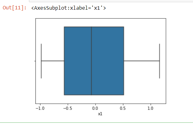
The figure below is an example of boxplot of a normally distributed data:

What we can infer from the boxplot?
It shows the distribution of data(feature/column) with the help of a box and whisker(a perpendicular line at both the end of the box).
- We can say it is another form of distribution graph.
- Boxplot provides a five-point summary which helps users to get critical information about the data.
- The five-point summary includes a minimum value, lower quartile (Q1), median value (Q2), upper quartile (Q3), maximum value.
- Whishkers are the horizontal line that are extended from the Q1 and Q2 respectively.
- It can be used to detect outliers.
- Any data point outside of the whiskers is an outlier.
- Length of the whiskers calculated as 1.5* inter-quartile range(IQR).
- Formulation of IQR=Q3-Q1. Therefore, this is also the length of the box.
- Data points that are red marked are the outliers, as these data points exceed the length of the whiskers.
- If data point more/less than 3*I.Q.R, then it is an outlier.
Enough of theory, let’s move to code…..
The code below generates a box plot using random data. Therefore, each run generates a different a diffenent boxplot.
import pandas as pd
import numpy as np
import matplotlib.pyplot as plt
import seaborn as sns

df = pd.DataFrame( np.random.randn(5, 3),index=["a", "c", "e", "f", "h"], columns=["x1", "x2", "x3"] )

sns.boxplot(x=df["x1"])
Output:
Boxplot with Outlier:
